Light & Land
Black and White photography by Adrian Beasley
15th May 2019
In the days of film, you either had to carry two camera bodies or simply commit to taking Black and White pictures for a roll’s worth of shots. These days we can select Black and White at the press of a button. Every digital camera has a Black and White mode; it might be available as a scene selection, or a processing option but it’s in there somewhere. Depending on your camera (DSLR or Mirrorless) you will then see the world in Black and White on the back of your camera or, better still, through the viewfinder. Some cameras allow you to do extra processing, for example, adding a filter. Shooting a blue-sky-landscape with a red filter will dramatically darken the sky in your Black and White image. Don’t worry if your camera has nothing other than a Black and White mode as most of the magic is done in your image editor.
Finally, shoot RAW as this will give us the maximum dynamic range when we process later. If you have dialled in any filters in-camera, these only affect the image you see on the camera back and the output jpeg’s if you chose to shoot RAW+Jpeg. I usually shoot in Black and White for the entire session and then import and convert the RAWs to Black and White in one go.
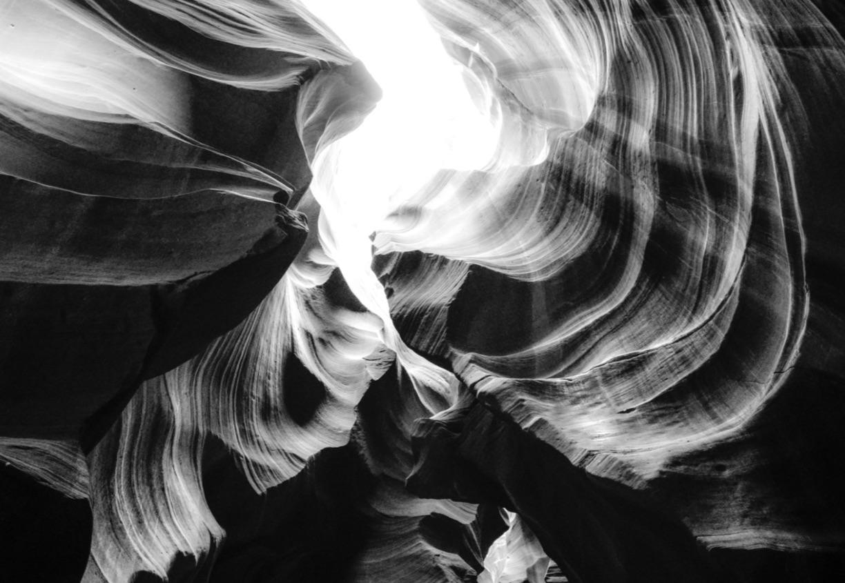
What subjects work best? Obviously you can shoot anything in Black and White! However, Portrait, Landscape and Architecture work especially well. Whatever you shoot, the key elements that make a subject work in Black and White are Contrast, Tone, Shape/Form and Texture. With your camera in Black and White mode, you can more easily see these elements as you compose your image.
Tone (or the conversion from colour to shades of grey) is slightly different. We cannot see the colours of a subject when the camera is in Black and White mode but the original colours are still recorded in the RAW file. That means we can adjust the relative shades of grey later when we develop. Whenever I see bold colours, I know I will have more options later in development.
Taking the picture is just the start... The darkroom is where the magic happens and these days we can develop the full potential of our Black and White images in our digital darkrooms, while sitting on the sofa sipping a cup of tea - how pleasant. Just as a film negative is never printed “straight”, it is extremely rare for our Black and White images to reach their full potential in-camera. We can almost always enhance them using our editing software. I will show some options in this article using Lightroom, but you will be able to do similar things in other editors.
Adjusting Contrast: Contrast is very important and there are lots of options for increasing and decreasing it...
Global Contrast Slider: The main contrast slider operates around the mid-point of the histogram. As you move the slider to the right, it will make the lighter pixels lighter and the darker pixels darker, hence increasing contrast. If your image is very light or very dark, the main contrast slider will not be as effective as the majority of your pixels will simply move together. In this case, the Shadow/Highlight adjustments might be more effective as they work in the regions below and above the mid-point.
Black / White Sliders: These sliders set the darkest and lightest pixels in your image. Dragging the Black slider left and the White slider right will stretch the histogram and enhance contrast but in a subtler way than the global contrast slider.
Shadow / Highlight Sliders: These sliders are extremely effective at controlling contrast in the shadow and highlight areas of your images. If you have blocked-up shadows, drag the Shadow slider right to bring out details. If your highlights lack details, drag the Highlight slider left to bring back contrast in the highlights.
Clarity: Unlike the sliders above, clarity introduces contrast between neighbouring pixels, no matter what their brightness. That makes clarity a very powerful control as it creates contrast in all areas of the image. I like to use clarity in skies to bring out detail. By its nature, clarity enhances noise in an image, creates halos along high contrast edges and blocks-up shadowsso use it carefully or locally. Negative values of clarity reduce contrast, softendetail and can create an ethereal look.
Dehaze: Think of dehazeas a global contrastslider that works by pushing the brightness of pixels downwards from the far right of the histogram. In other words, the brightest pixels stay bright but the darker pixels are quickly made darker. In Black and White images, dehazeis a VERY powerful contrast control. Negative values of dehazereduce contrast and lighten an image.
Tone: Each colour in a scene is converted to a shade of grey. We can adjust how eachcolour is converted to grey using the Black/White panel. For example, dragging the Red slider to the right will make all areas of the image with Red appear as light grey, dragging left will darken areascontaining Red. Use these sliders to radically alter the tones in an image that contains lots of colour. The Targeted Adjustment Tool (TAT) helps you to choose the right slider to use. Use the Tone Curve to flexibly adjust the tones across an image. Switch it into its point-curve mode by clicking the little symbol bottom right. In this mode you can shape the curve manually and adjust multiple regions, increasing and reducing contrast across the tonal range.
Texture: Texture in an image can be enhanced with clarity and sharpening but take care not to introduce excessive noise and halos around your high contrast edges. When using sharpening, make sure that the masking or threshold control is moved away from 0. In Lightroom, use the Alt/Opt key while adjusting masking to make sure you don’t sharpen smooth tones in your image. Sharpening and clarity are often best applied locally.
Noise and Clipping: With Black and White, noise is a creative choice. Enhancing contrast may result in increased digital noise, it is up to you how much is too much. If you need to manage noise, consider using a local adjustment rather than soften the entire image.It is not unusual to have areas of total black or white in Black and White images. Take a look at where the warnings are and decide if you need to lift the blacks/shadows or reduce the whites/highlights. When it comes to printing, the point of blocking up depends on your paper/ink. Using print targets will help identify your paper capability and you can produce a print proof to adapt to the paper constraints and maintain the same level of shadow detail that you have on screen.
Toning: Black and White images are regularly toned with a subtle colour. Cool blues, antique sepias or warm tones are commonly used. Use the Split-tone panel to add low levels of colour to the shadows, highlights or both. Take care with saturation, it is very easy to overdo, so re-check your toning at a later date.
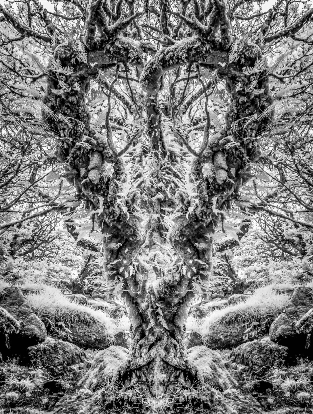
More areas to exploreIn this short article, we have barely scratched the surface. Infrared photography is an area where the results are often presented in Black and White. While classic infrared images show blackwaterand skies with luminous trees and ghostly people, there is so much more to digital infrared photography. I tend to use my IR camera outside of the brightest and hottest months to capture images with unique contrast.
Digital camera sensors are extremely sensitive to Infrared light, much more than film. It is such a problem that camera manufacturers add a special Infrared filter to the sensor to remove almost all the Infrared light. My experience shows that these filters are so good in the latest cameras that trying to shoot IR by adding a typical “IR filter” to the lens is completely ineffective. If you are interested in shooting Infrared images, you should consider buying an adapted camera or converting one. Fortunately, ebaycan be a great source of converted cameras as many people make the conversion and then find they don’t like the results!
Other areas to explore when taking pictures or developing for Black and White: Shadows, minimal compositions, long exposures, high and low key images.
If you would like to take part in a Black and White workshop with Light and Land, here is what we have coming up over the next 6 months:
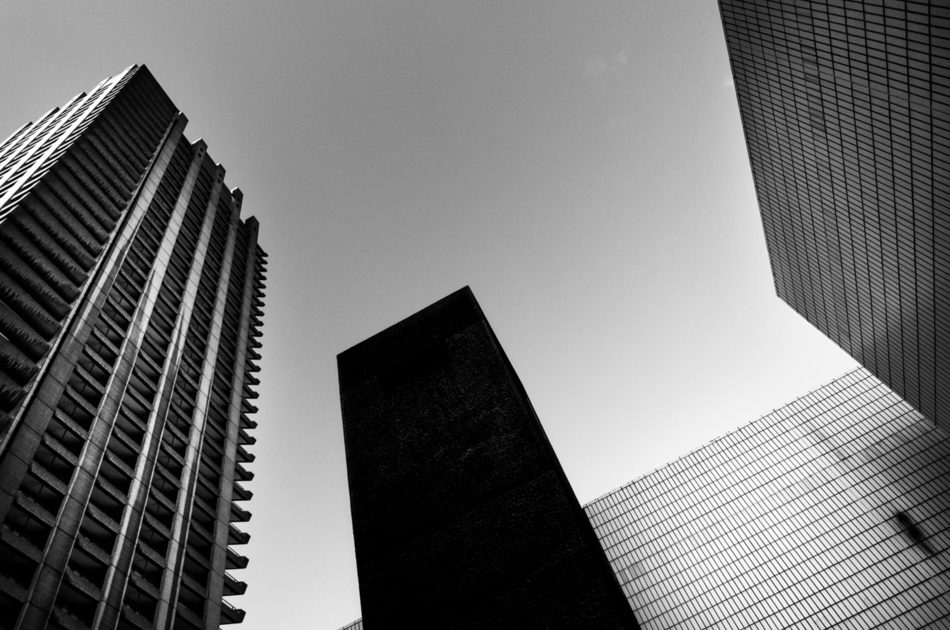
Brutalist and Modern Buildings in Black and White (London) | 8 Octovber 2019 | With Adrian Beasley
Prague in Black and White | 7 - 10 November 2019 | With Adrian Beasley and Paul Sanders
Written by Adrian Beasley
Photos by Adrian Beasley


")